Identité visuelle et packaging
--
Un branding élégant et espiègle pour une gelateria pas comme les autres
Il Pinguino Furbo, c’est bien plus qu’une simple boutique de gelato. Avec une personnalité audacieuse et raffinée, cette marque joue sur l’image d’un pingouin rusé, arborant un look chic et mystérieux. L’objectif était de capturer cet esprit unique dans une identité visuelle forte et reconnaissable.
Un pingouin avec du caractère
L’élément central du branding repose sur un logo illustratif minimaliste, en noir et blanc, qui évoque à la fois l’élégance et la malice. Le pingouin, coiffé d’un chapeau, incarne le côté sophistiqué de la marque tout en conservant une touche ludique et intrigante. Un design qui attire l’œil et suscite la curiosité.
Entre raffinement et gourmandise
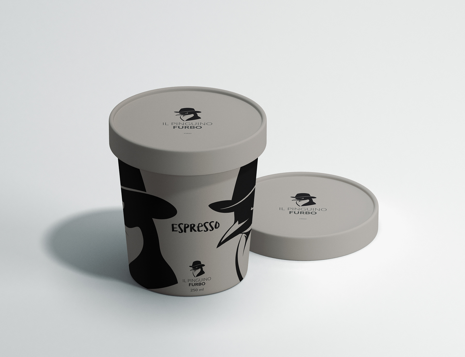
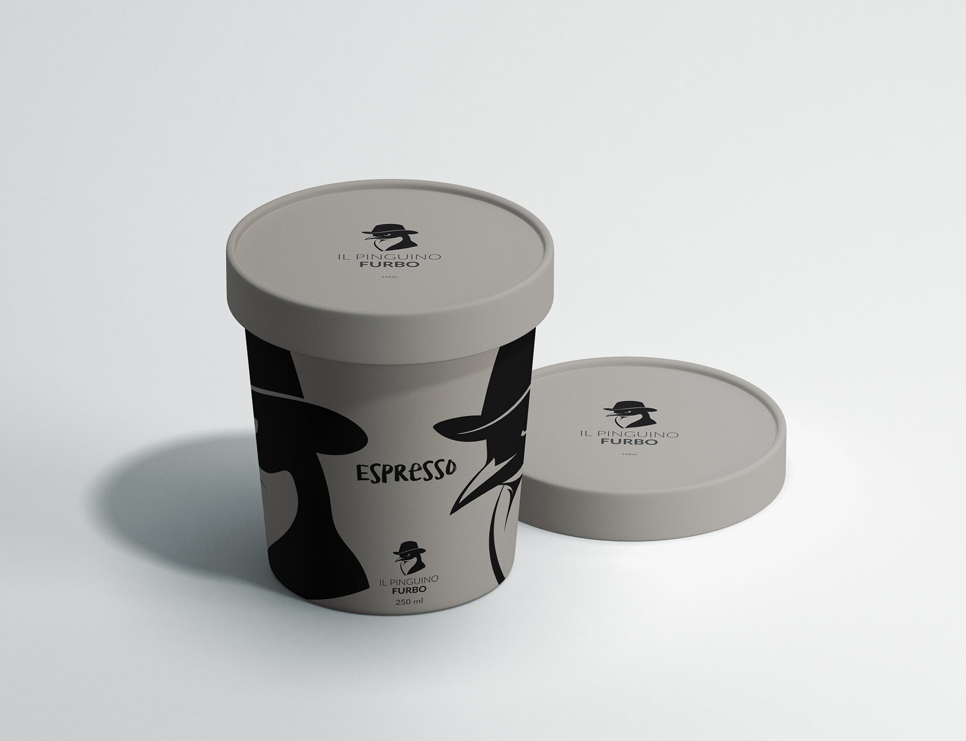
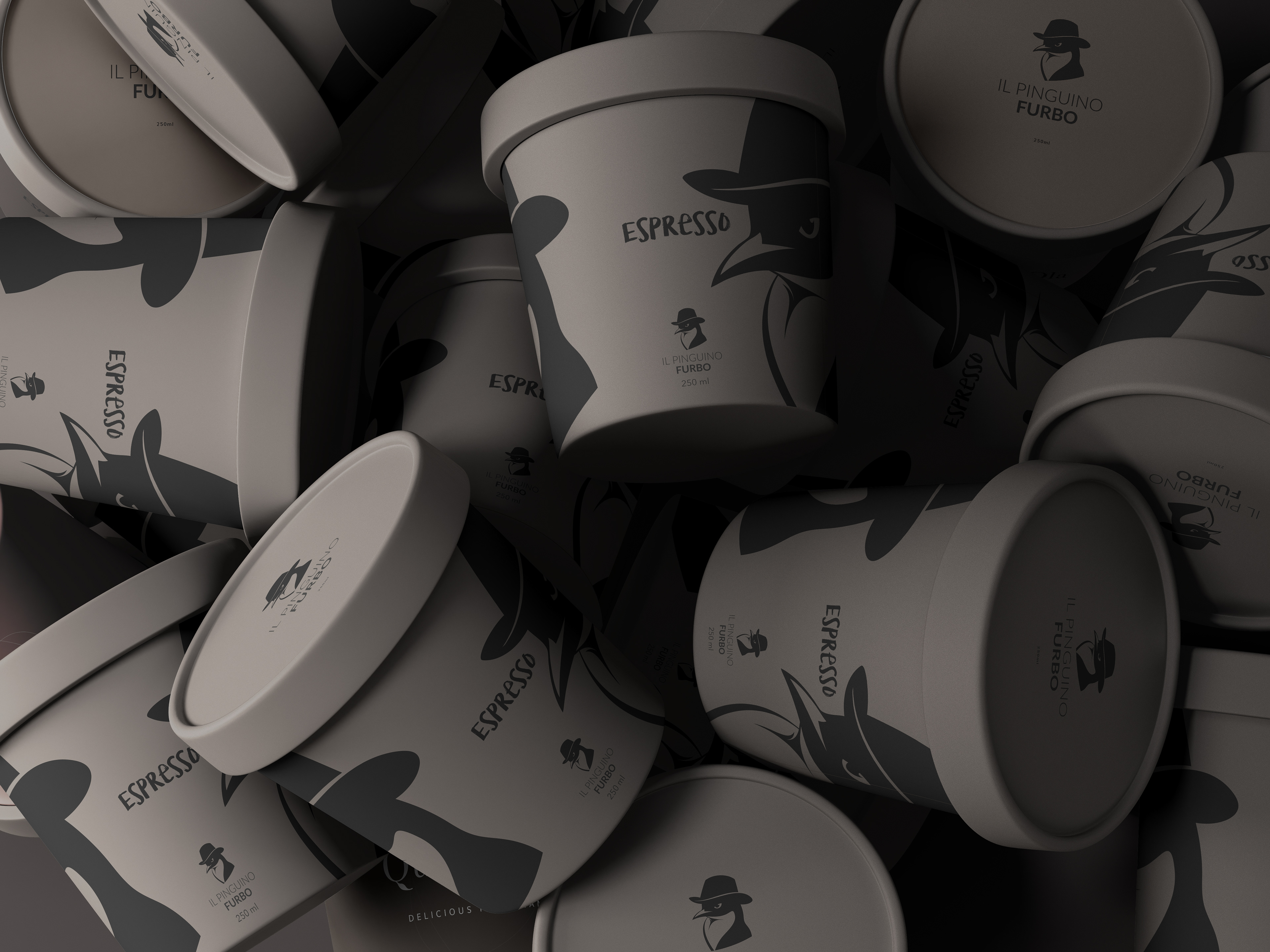
Pour les emballages, j’ai conçu un design qui joue sur les contrastes et la simplicité, en mettant en avant l’univers graphique du logo. L’idée était de créer un packaging à la fois premium et accessible, reflétant la qualité artisanale des gelatos proposés par Il Pinguino Furbo.
✔ Noir et blanc pour une identité forte et intemporelle
✔ Typographie moderne et épurée pour une lisibilité optimale
✔ Design adaptable pour les différents supports (boîtes, pots, sacs, affiches…)
✔ Typographie moderne et épurée pour une lisibilité optimale
✔ Design adaptable pour les différents supports (boîtes, pots, sacs, affiches…)
Avec ce projet, j’ai cherché à allier esthétique et stratégie de marque pour donner à Il Pinguino Furbo une identité qui se démarque sur le marché des gelaterias. Un projet gourmand et inspirant!
Visual Identity and Packaging
--
An Elegant and Playful Branding for a Gelateria Like No Other
Il Pinguino Furbo is much more than just a gelato shop. With a bold and refined personality, this brand plays on the image of a clever penguin, sporting a chic and mysterious look. The goal was to capture this unique spirit in a strong and recognizable visual identity.
A Penguin with Character
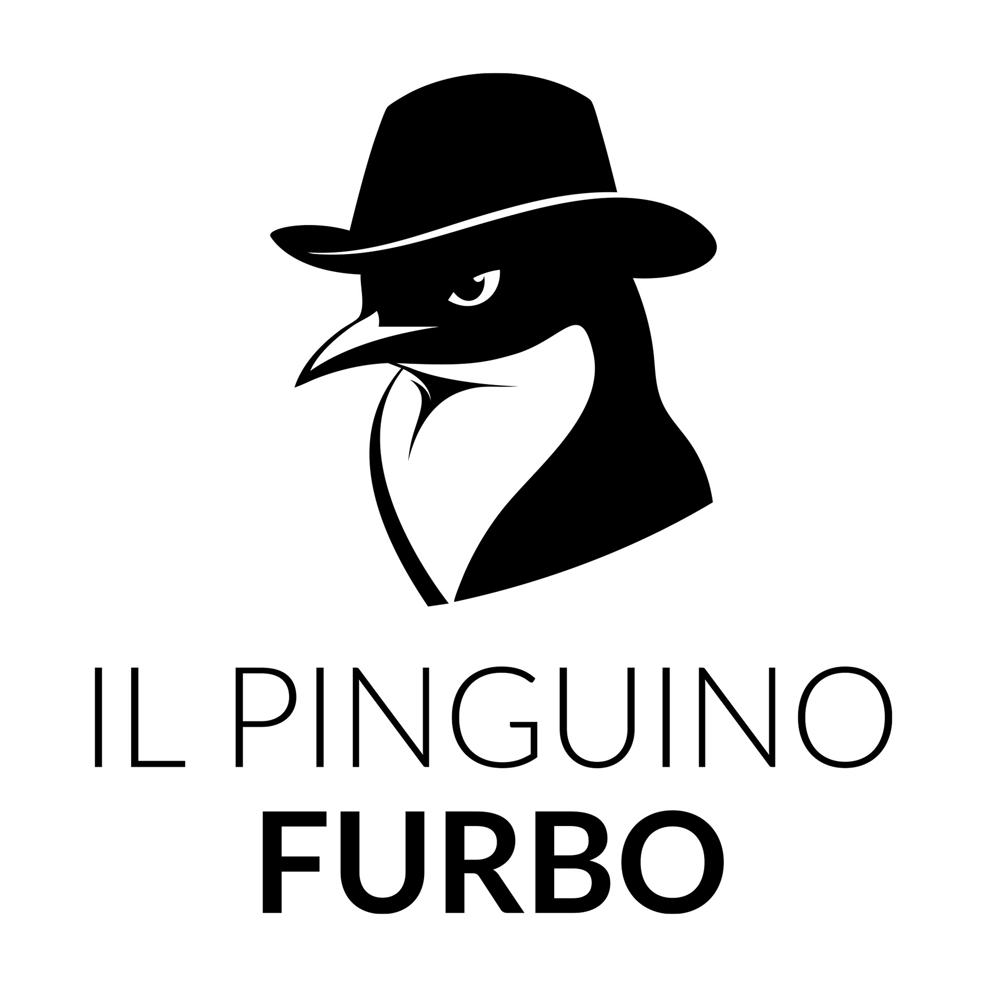
The core of the branding relies on a minimalist, black-and-white illustrative logo that conveys both elegance and mischief. The penguin, wearing a hat, embodies the brand’s sophisticated side while maintaining a playful and intriguing touch. A design that catches the eye and sparks curiosity.
Between Refinement and Indulgence
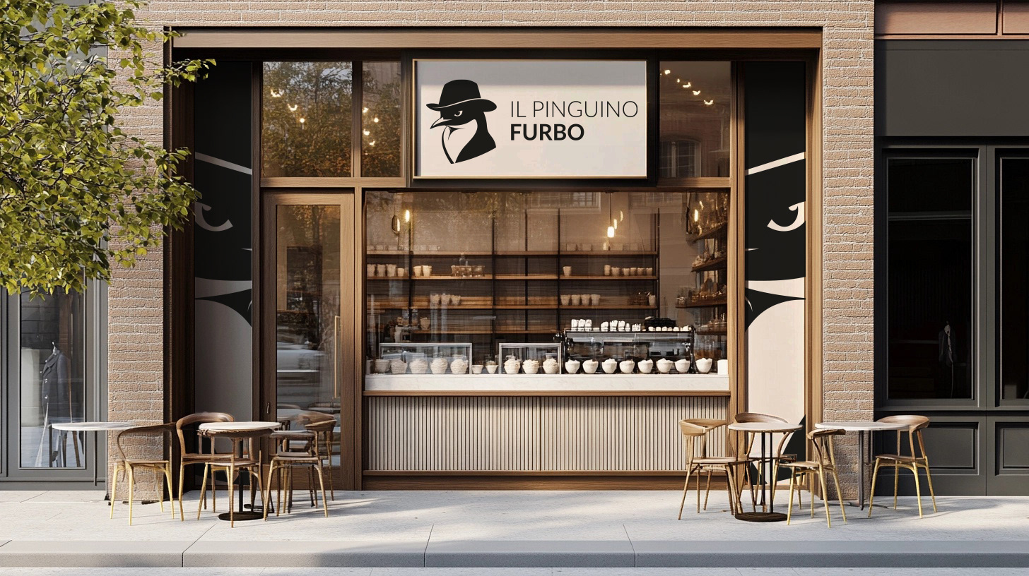
For the packaging, I designed a concept that plays with contrasts and simplicity, highlighting the brand’s graphic universe. The idea was to create packaging that is both premium and accessible, reflecting the artisanal quality of the gelatos offered.
✔ Black and white for a strong, timeless identity
✔ Modern, sleek typography for optimal readability
✔ Adaptable design for various formats (boxes, cups, bags, posters…)
✔ Modern, sleek typography for optimal readability
✔ Adaptable design for various formats (boxes, cups, bags, posters…)
With this project, I aimed to blend aesthetics and brand strategy to give Il Pinguino Furbo an identity that stands out in the gelateria market. A delicious and inspiring project!